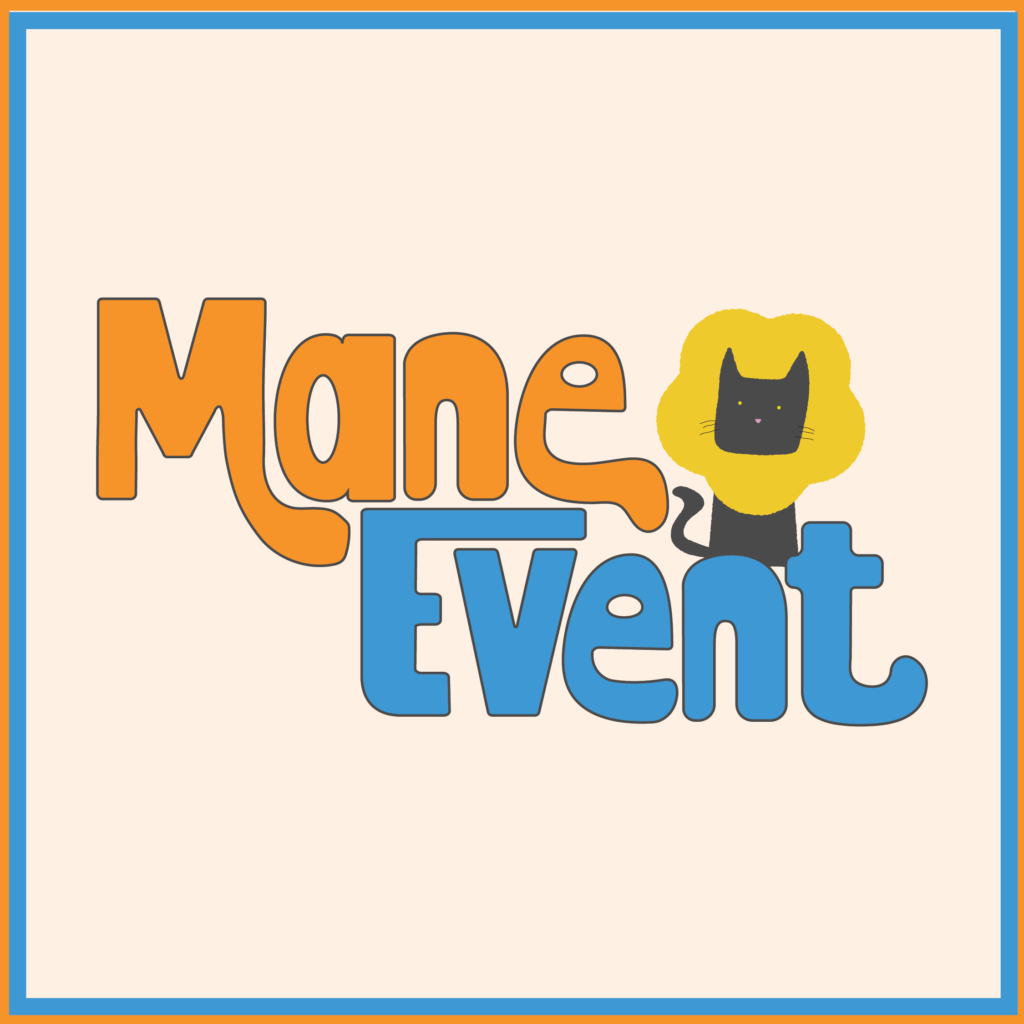
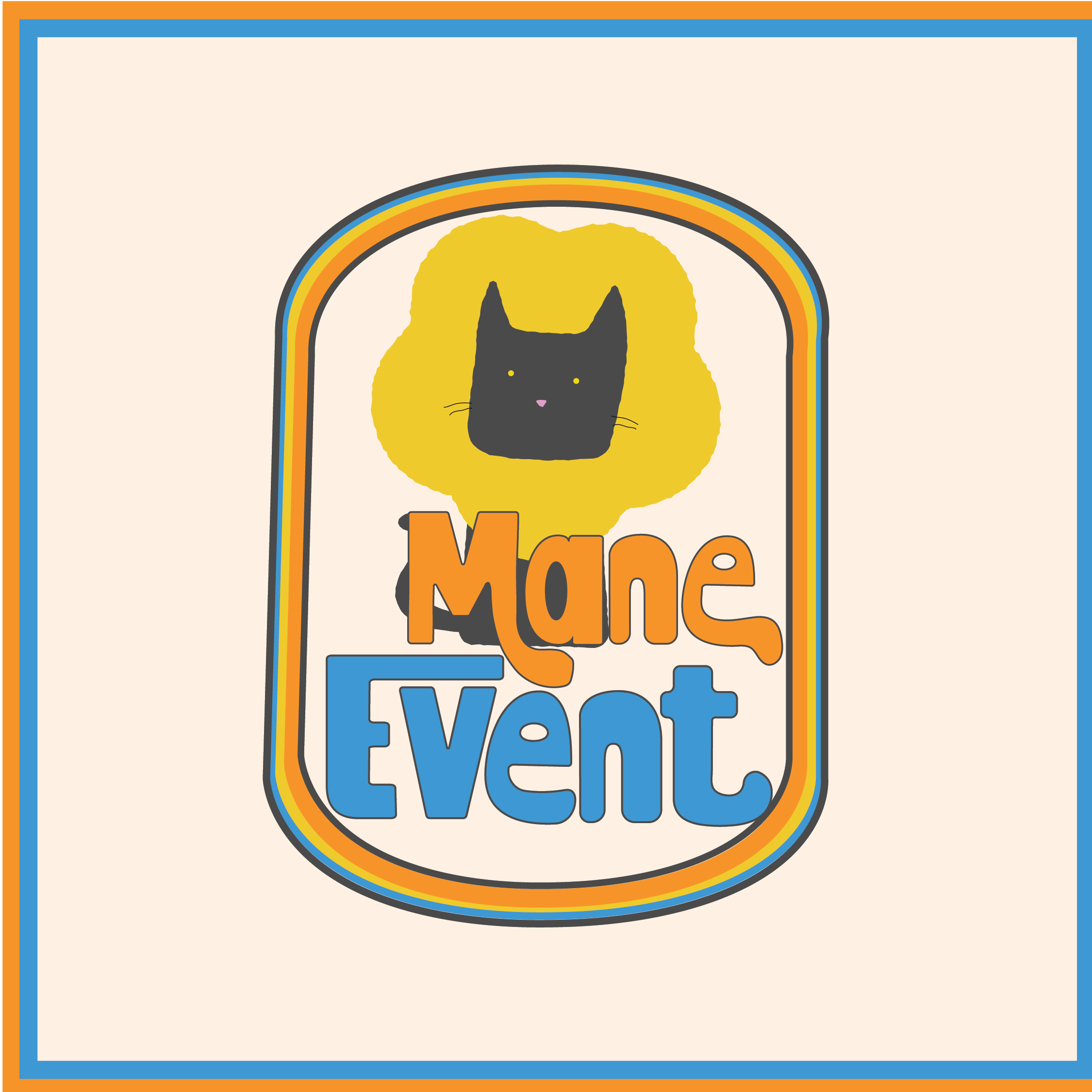
Mane Event is a local pet grooming service. For this project I wanted to go for a more retro 70s look on the design. The goal was to play on the word “mane” making the cat look like a lion. This groomer is a fun place to go in order to get your pet squeeky clean!
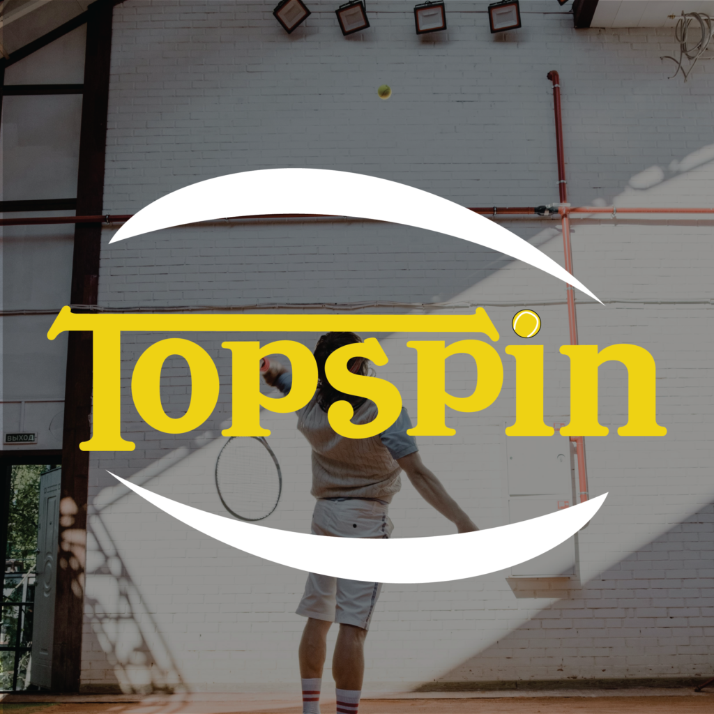
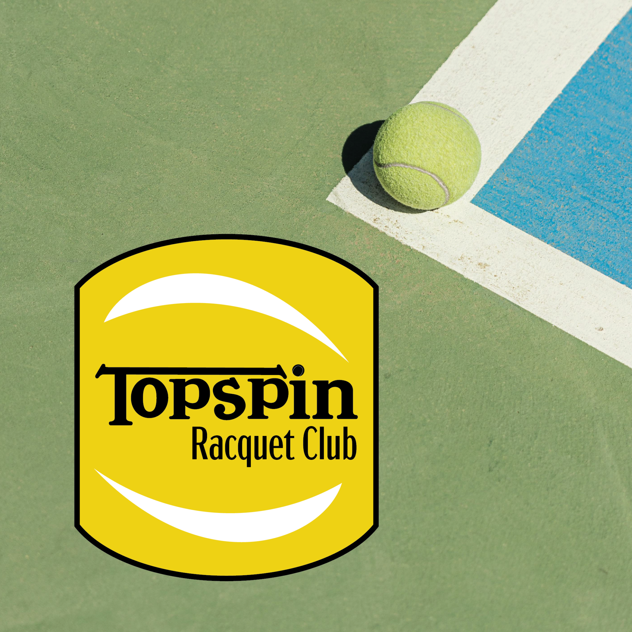
Topspin is a state-of-the-art and vibrant community of racquet sports enthusiasts. Nestled in the heart of the city, this club is for beginners and experts alike to enjoy some competition. For this design I wanted to go for a sporty yet modern look, I did not want to get too far into the sport aspects of this design. By adding the white graphics it gives not only the color pallet of tennis but also represents the spin that goes on the ball when playing racquet sports.
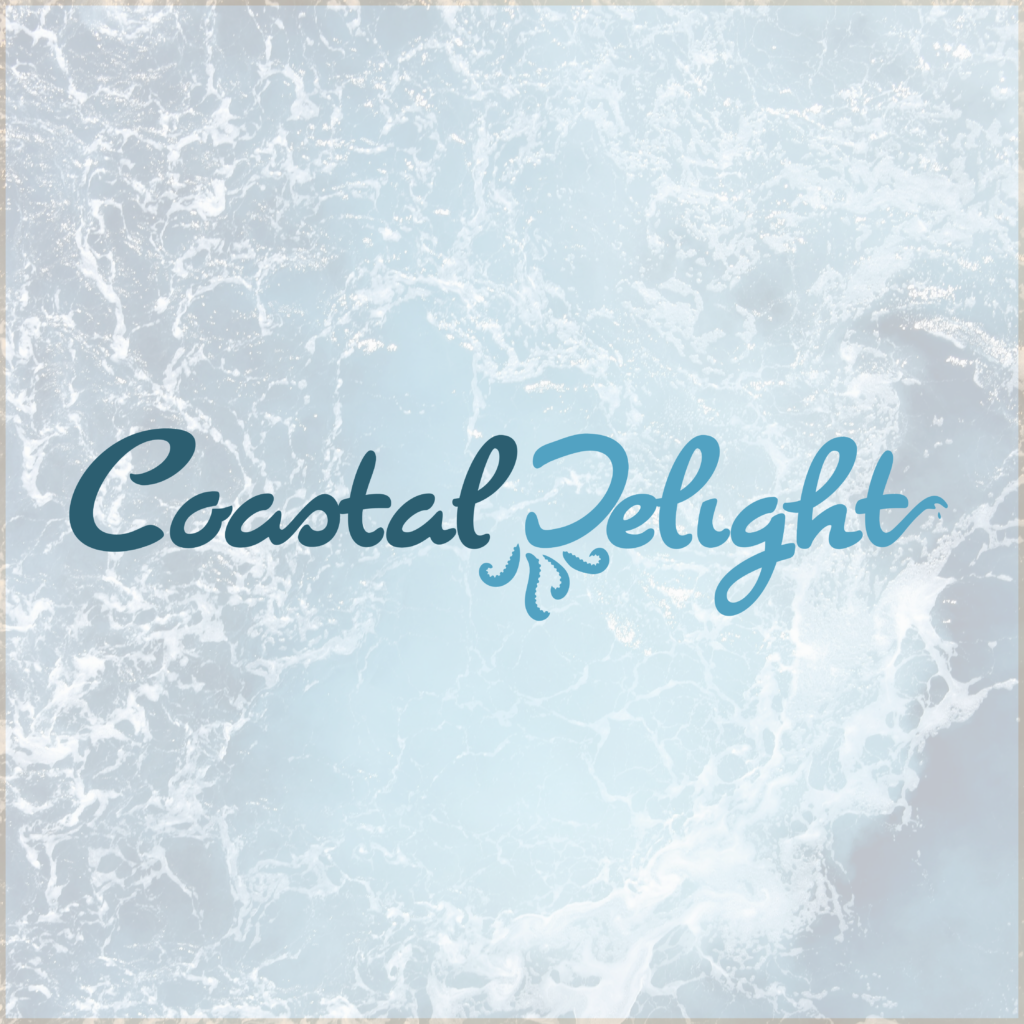
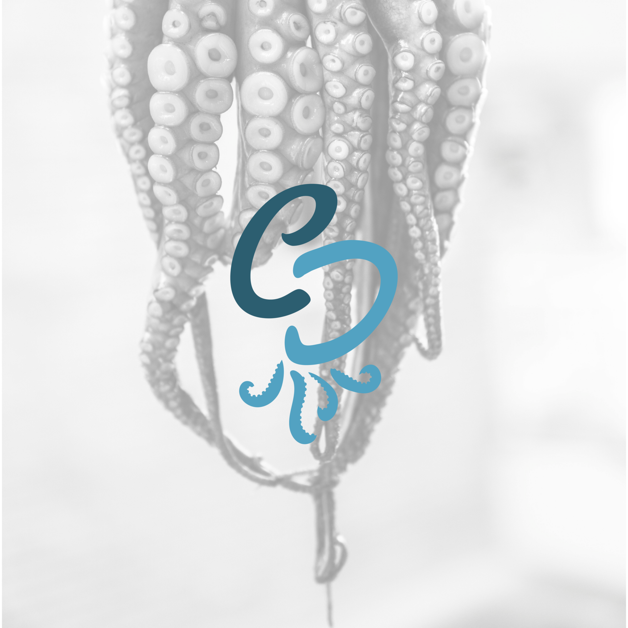
Costal Delights is a seaside bakery that can make all kinds of baked goods! Whether it is cookies or a gourmet cake, Coastal Delights is the place to go! When making this design I pulled a lot of inspiration of sea life, especially the octopus as this bakery can do so many different things at once it’s like they have 8 arms! I also chose to include the sea inspiration as they are located on the coast and local tourism is their main audience.
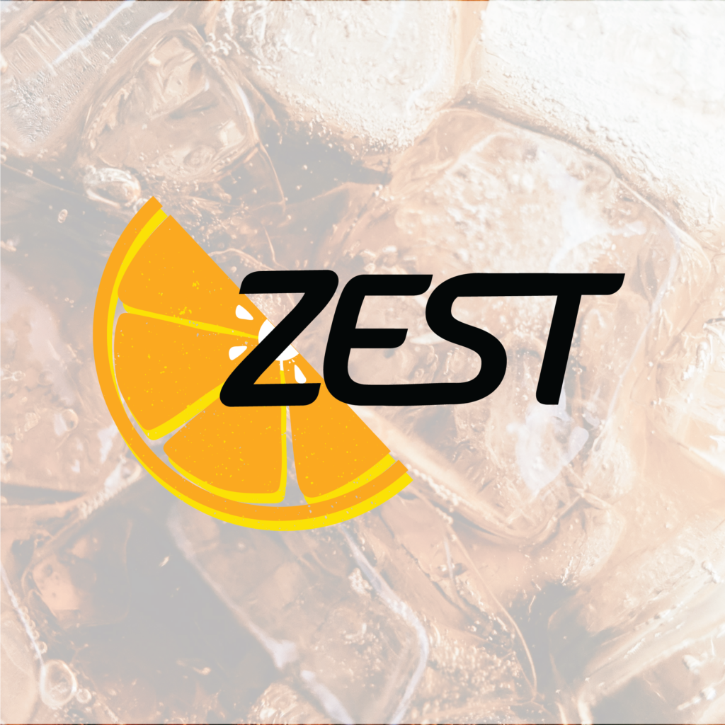
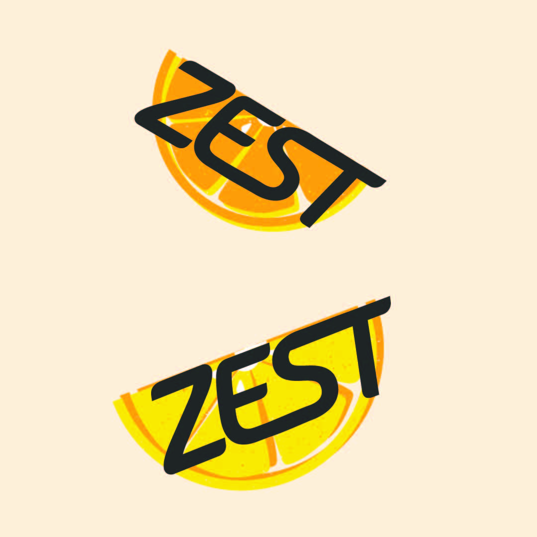
Zest is a lemon based tea brand that can really spice up your day naturally! When designing for this brand, we wanted to have a more playful style while still keeping the brand classy, which is why I went with a basic typography and a color full graphic. The goal is to make it stand out on the shelves once it enters the retail space, and I did this though a bright color pallet.